
Alpine Lager
Year 2020-2021
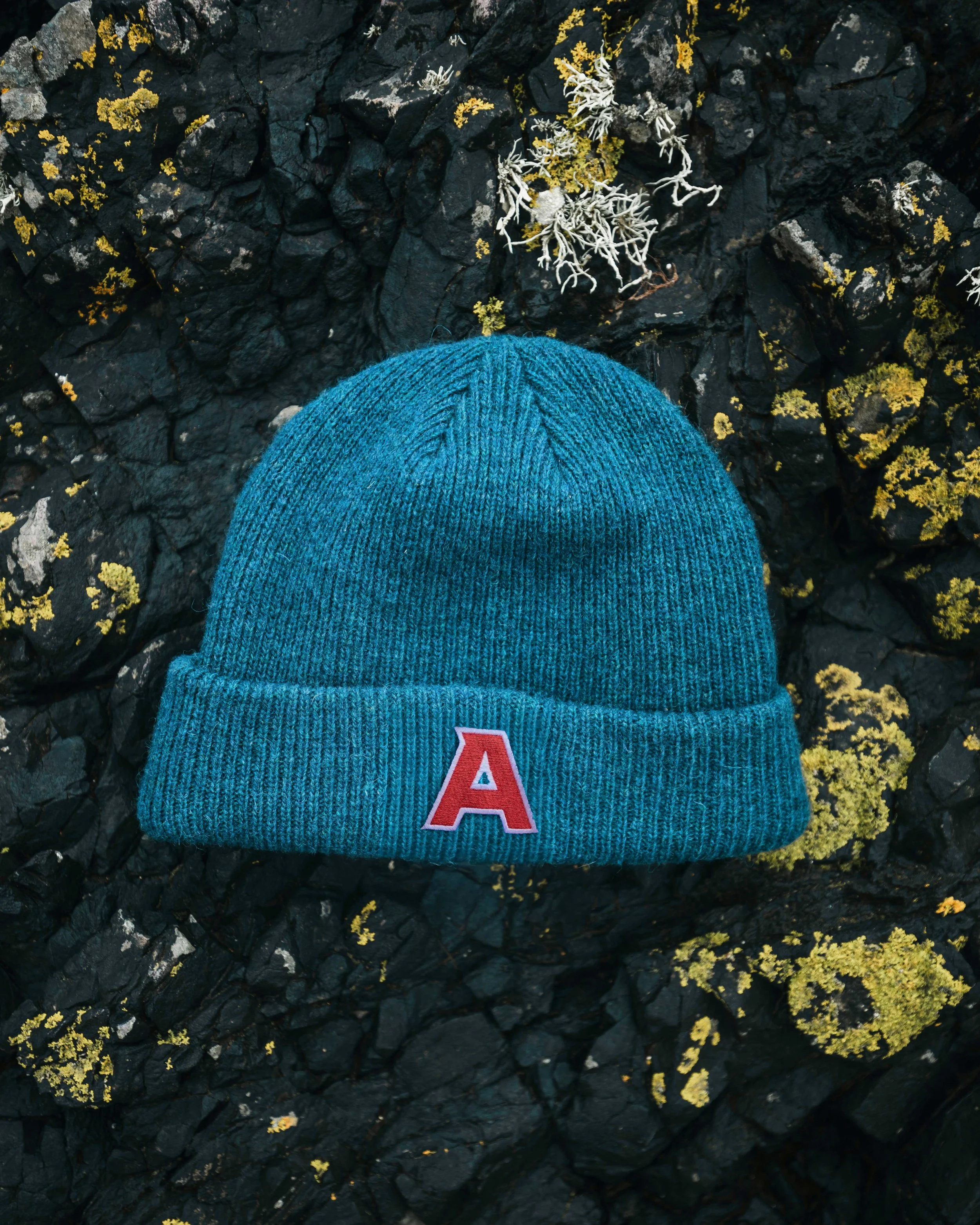
Services Brand, Print, Packaging
Role Senior Designer
Studio Art & Mechanical
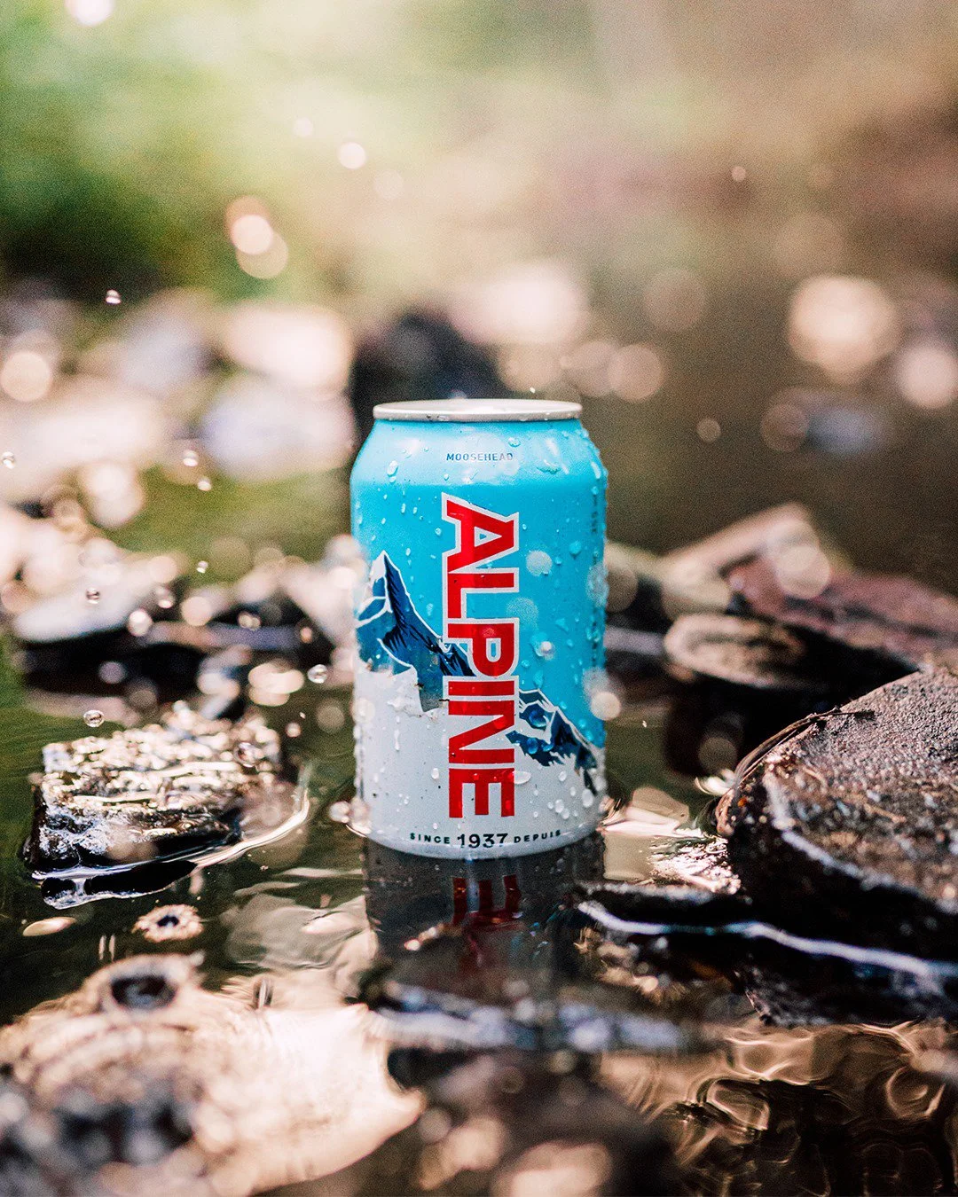
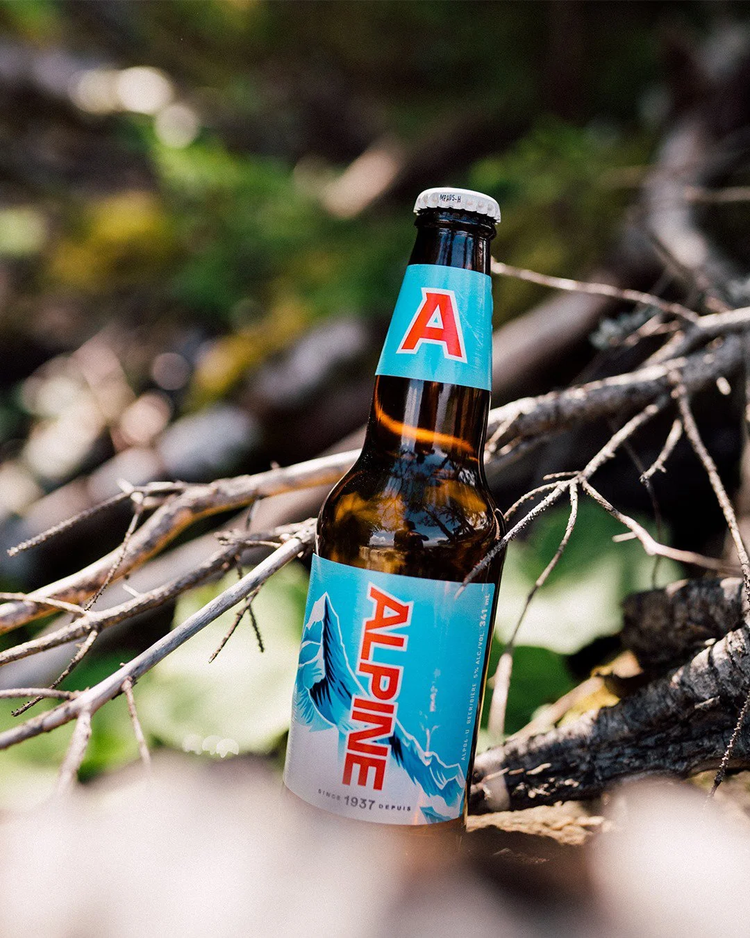
Alpine Lager’s original branding relied heavily on dark navy, which didn’t fully reflect the bright, refreshing nature of the beer. Our redesign introduced a fresher, lighter palette that better captures the lager’s crisp character.
We preserved the signature mountain graphic but refined and modernized it to feel more dynamic and contemporary. The logo and overall branding received a full redesign to inject new energy into the lager’s identity, striking a balance between honoring its heritage and embracing a vibrant, updated look.
Photography by Brock Jorgensen