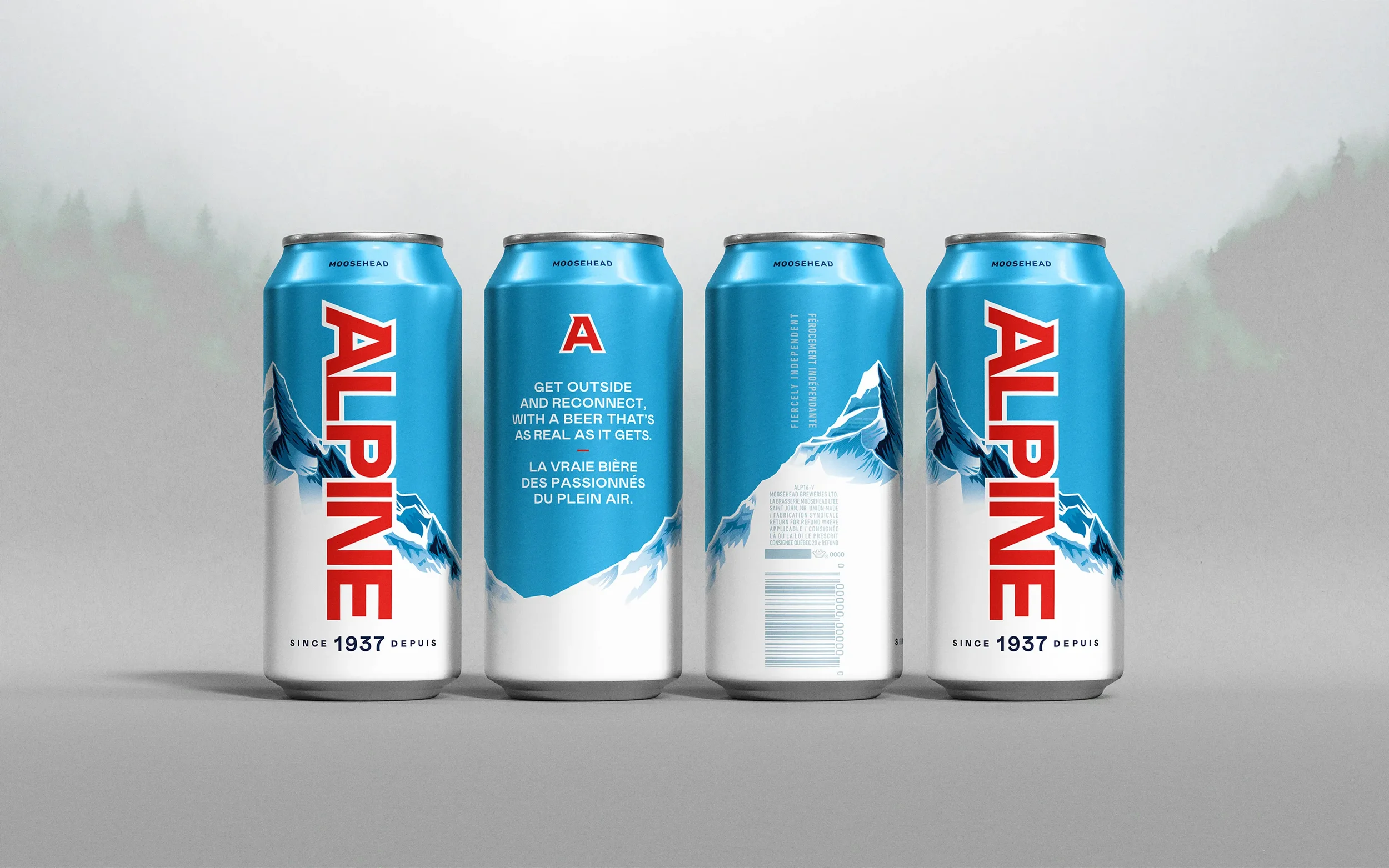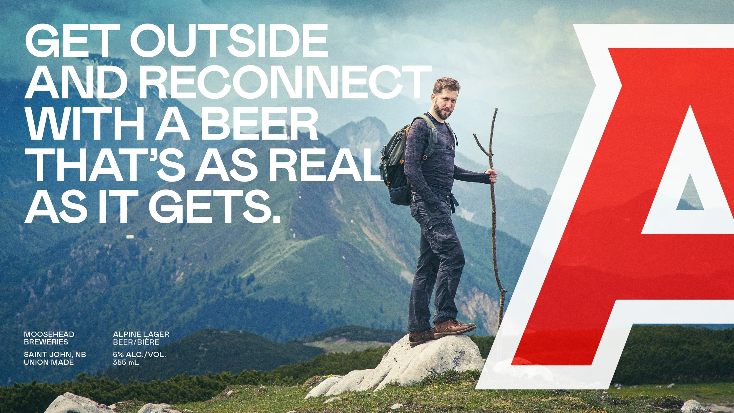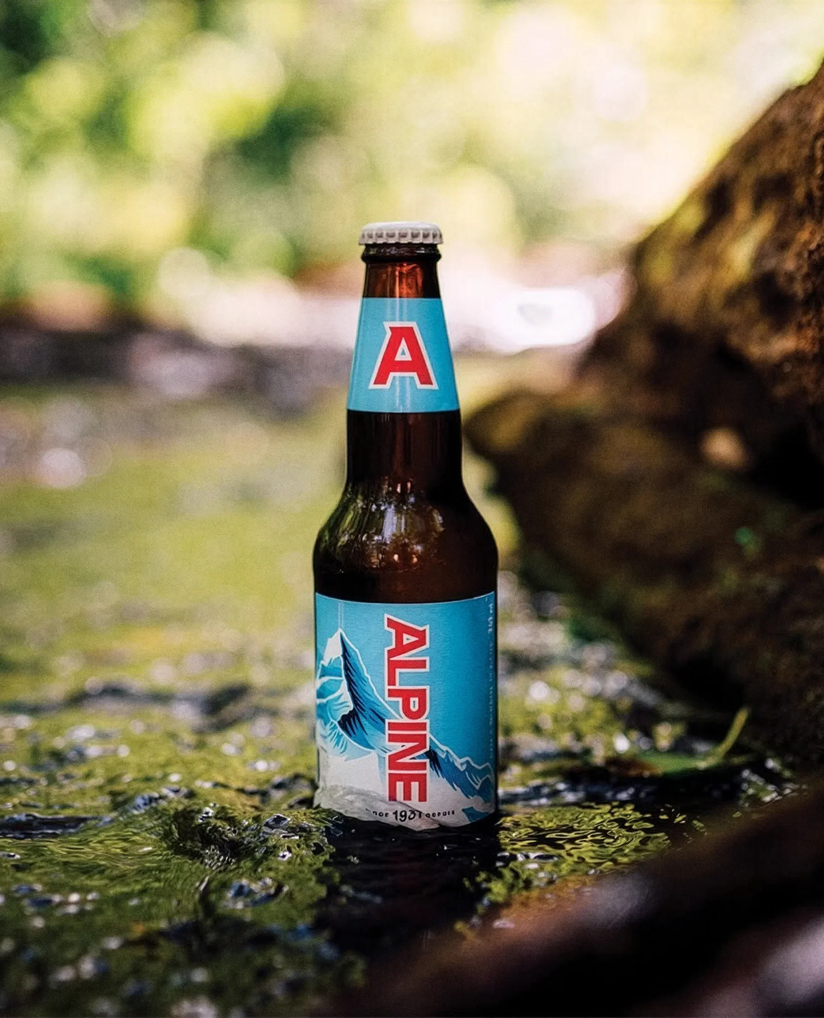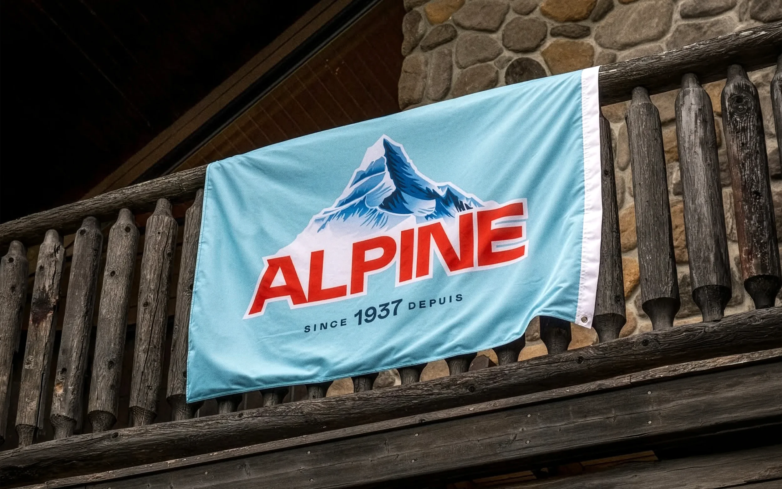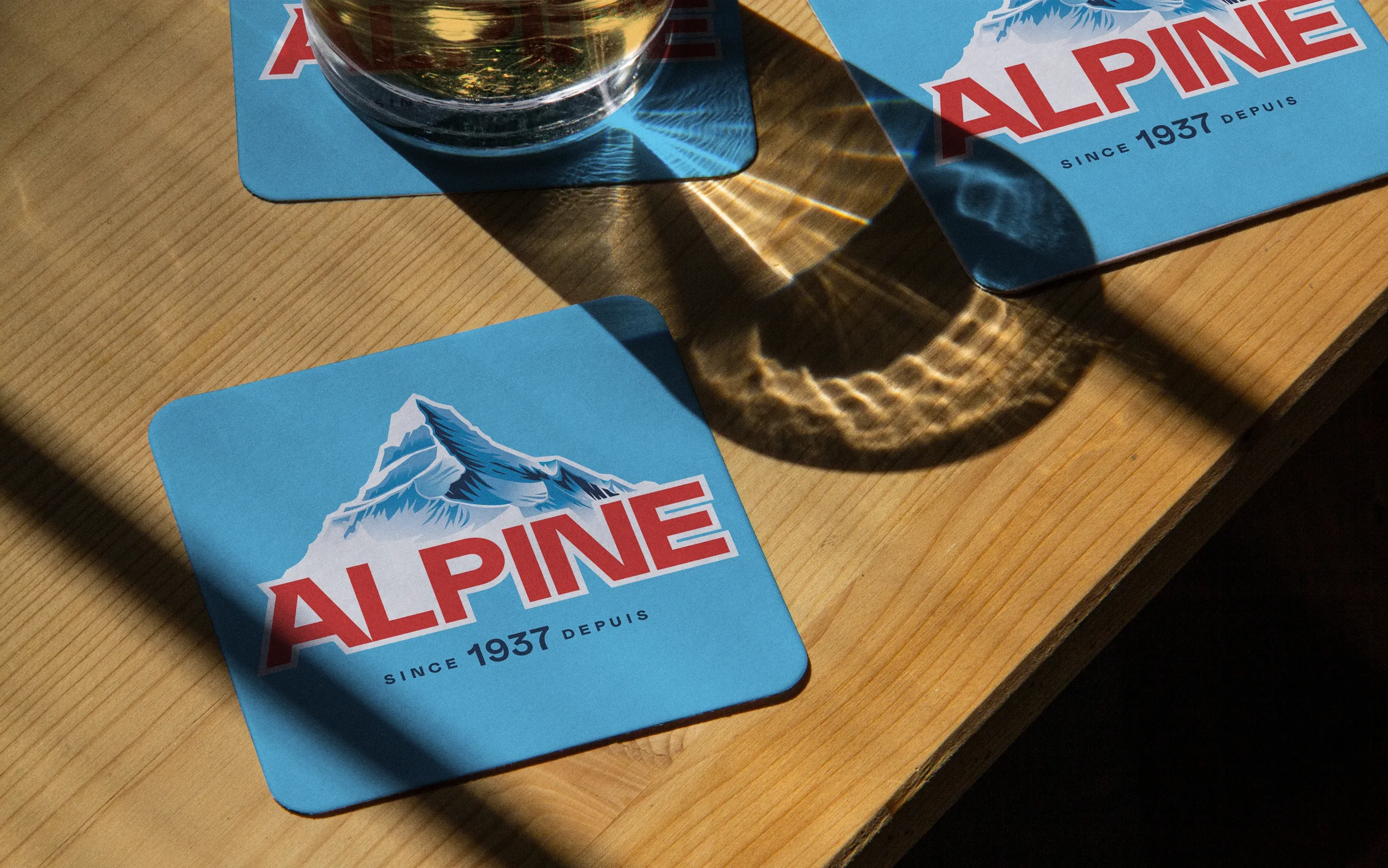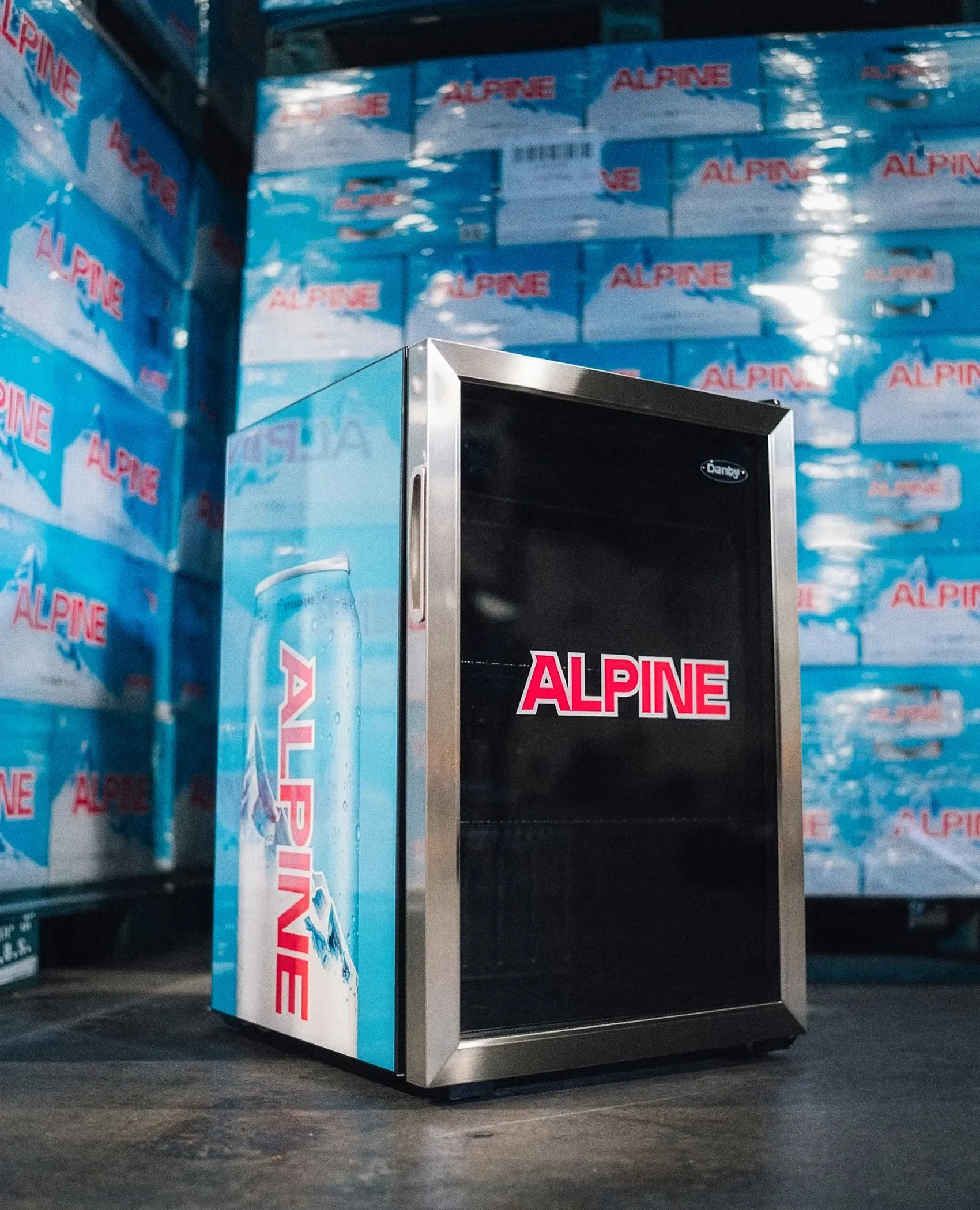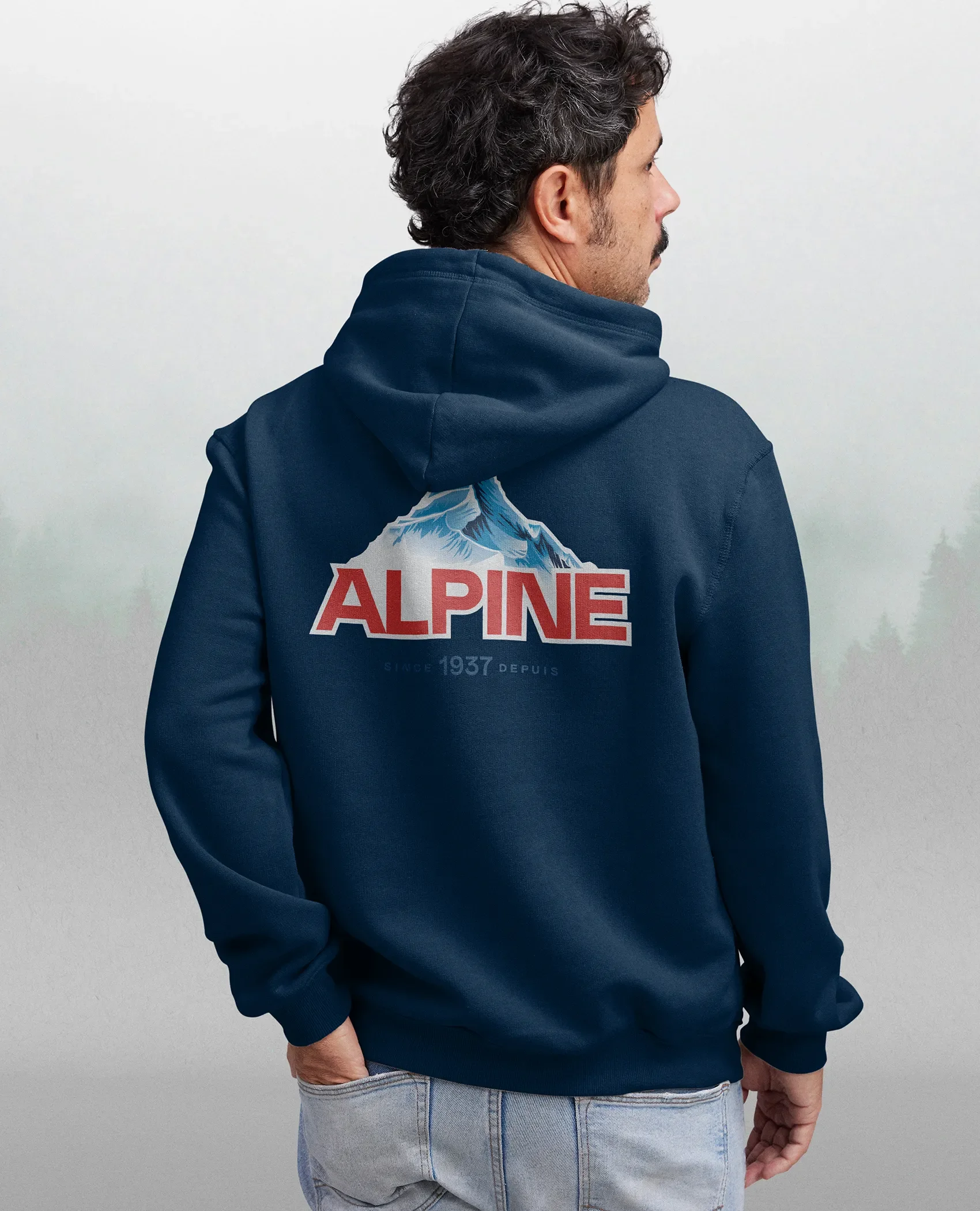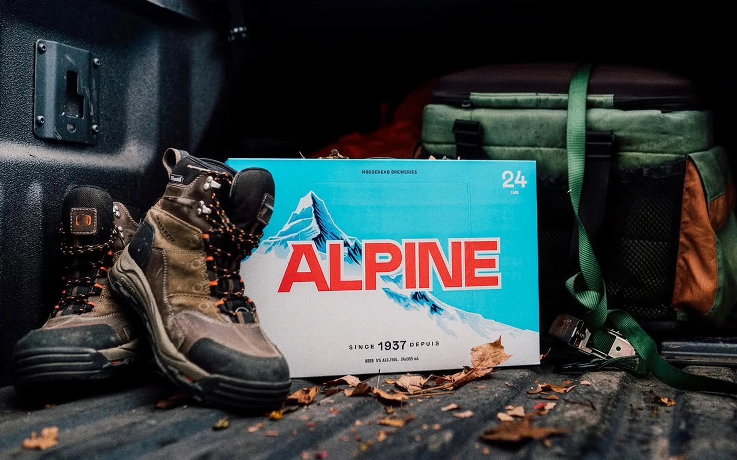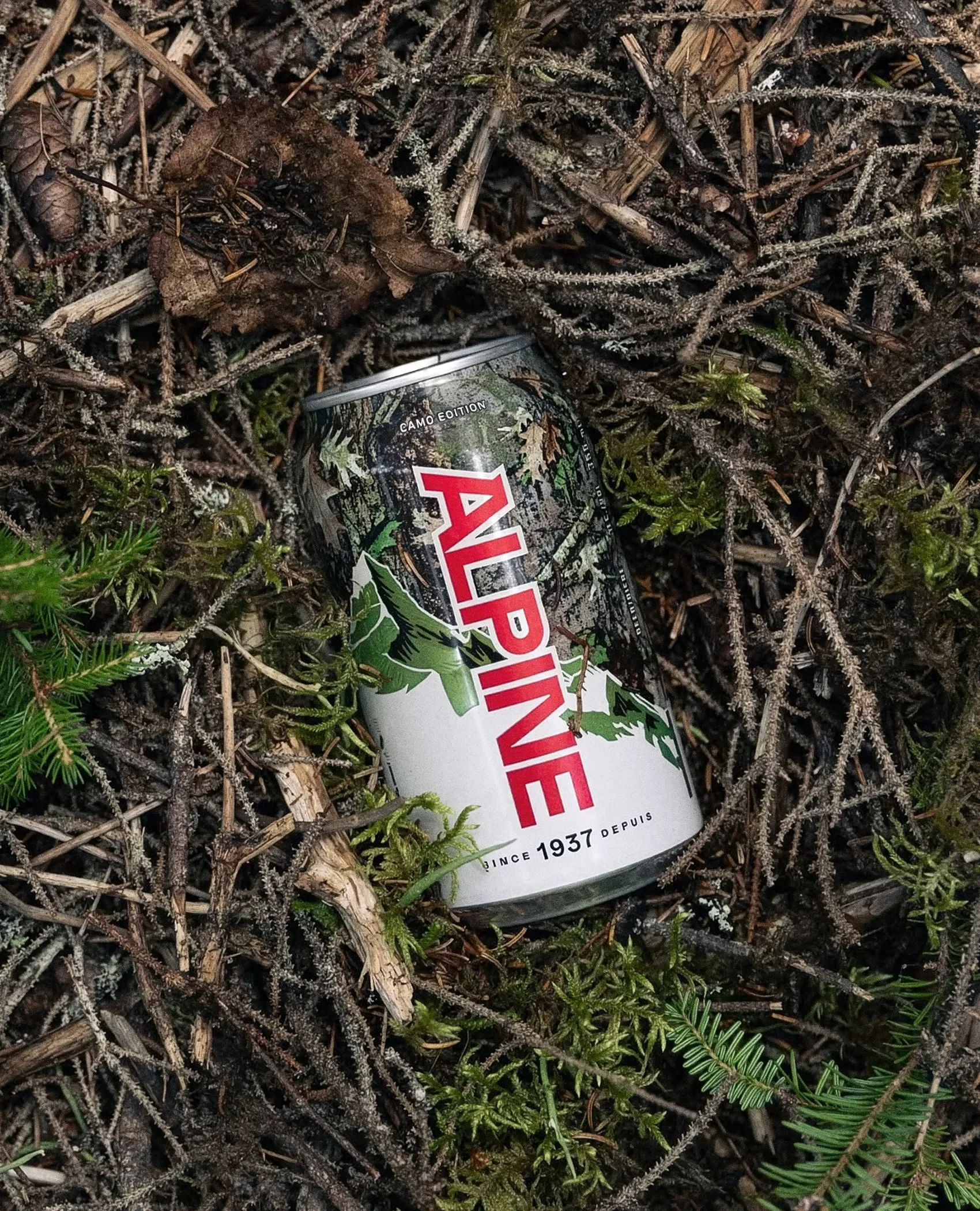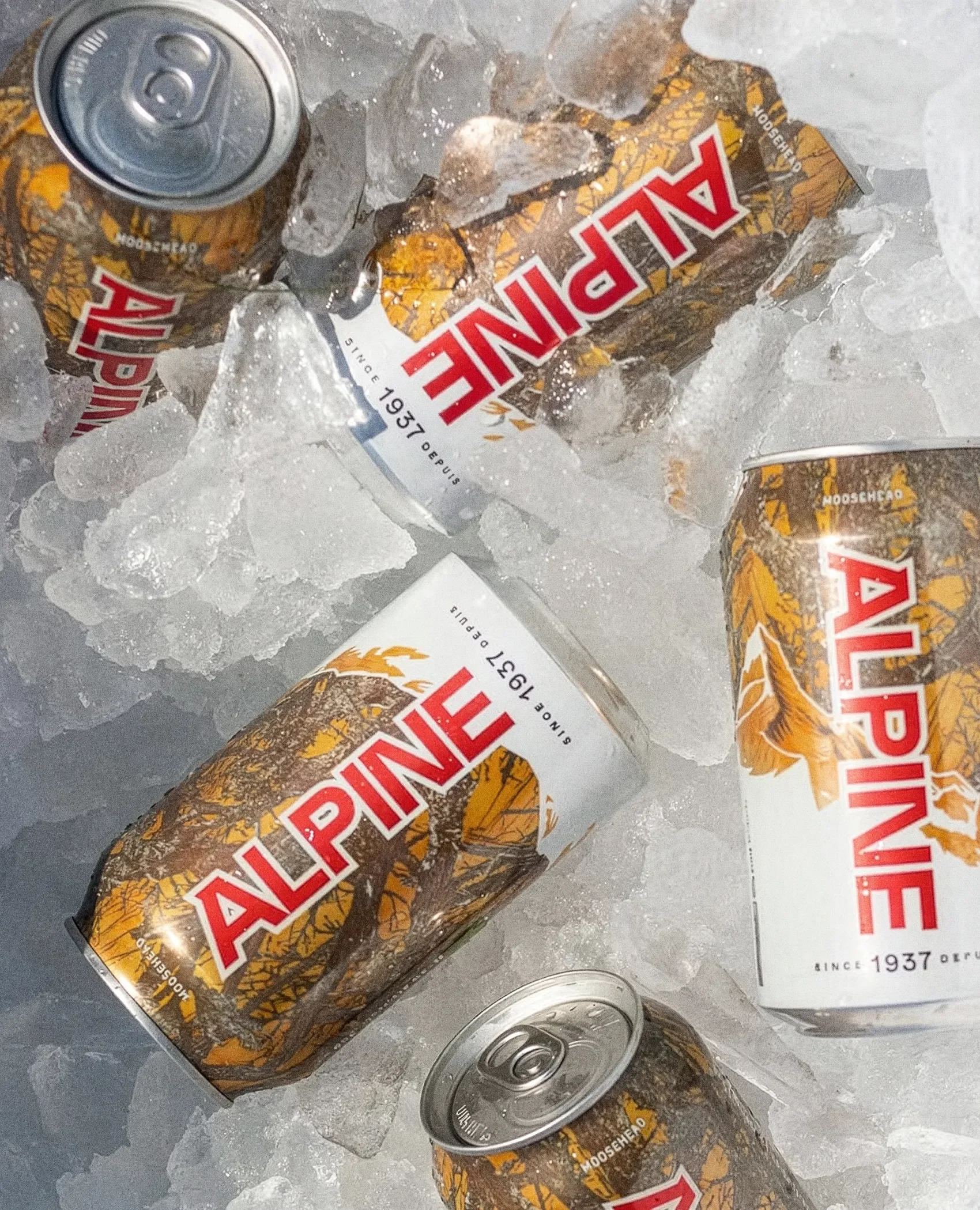
Alpine Lager
Services Brand Identity System
Role Design Lead
Studio Art & Mechanical
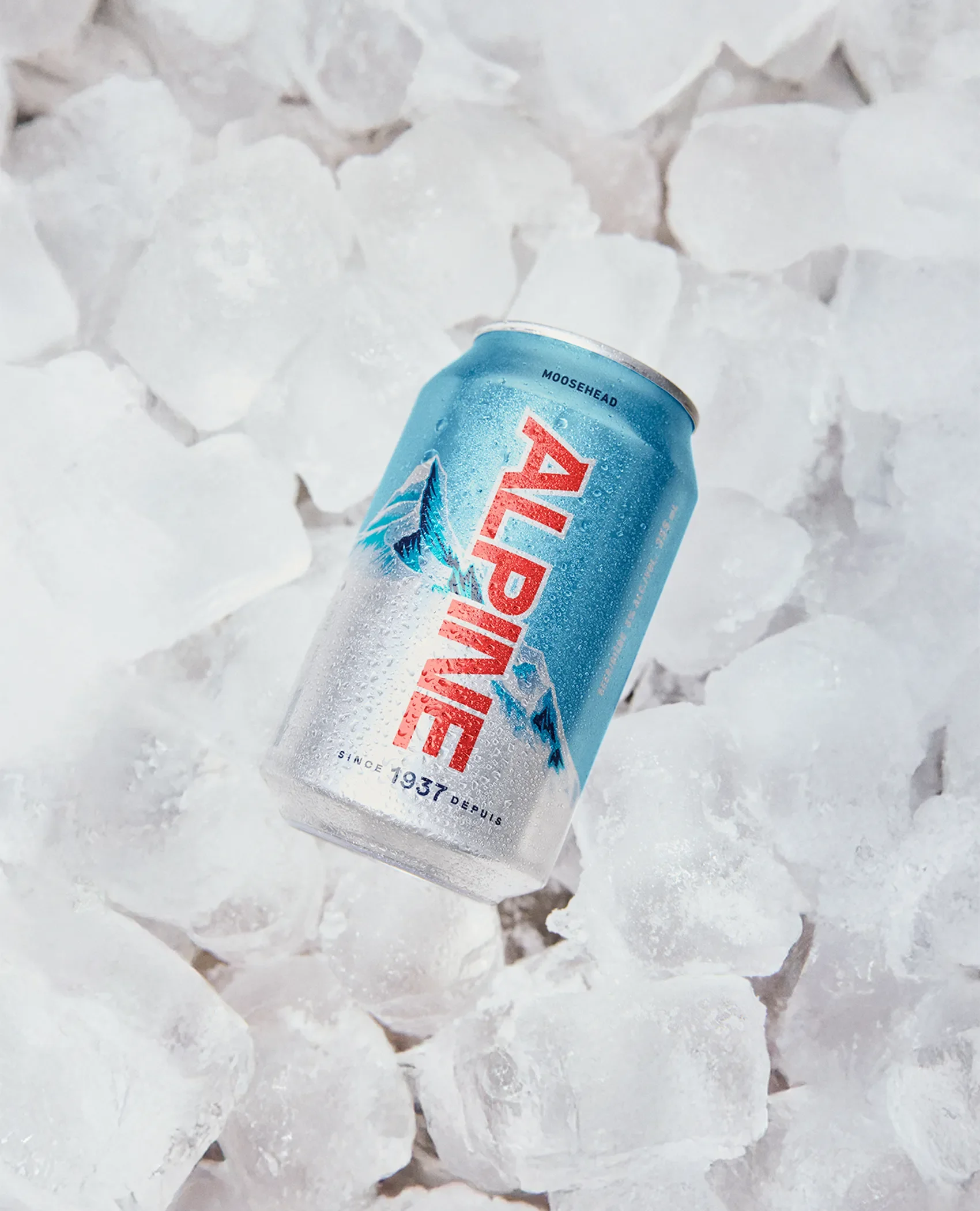
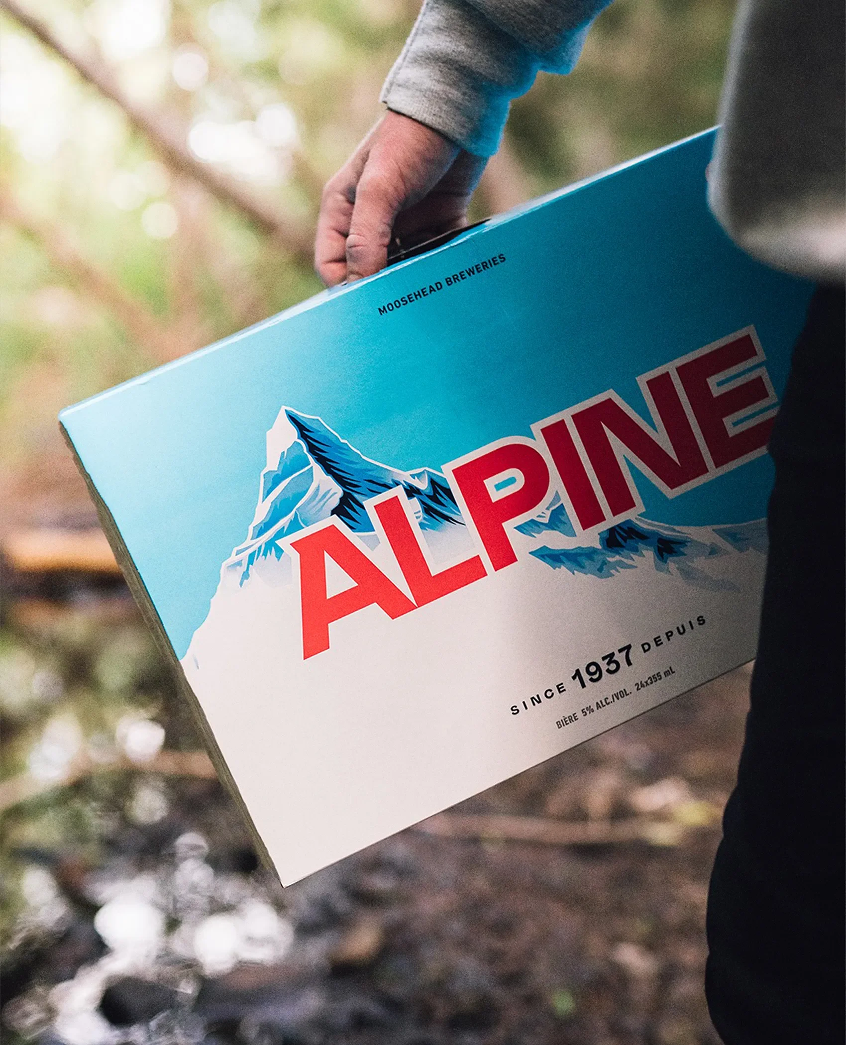
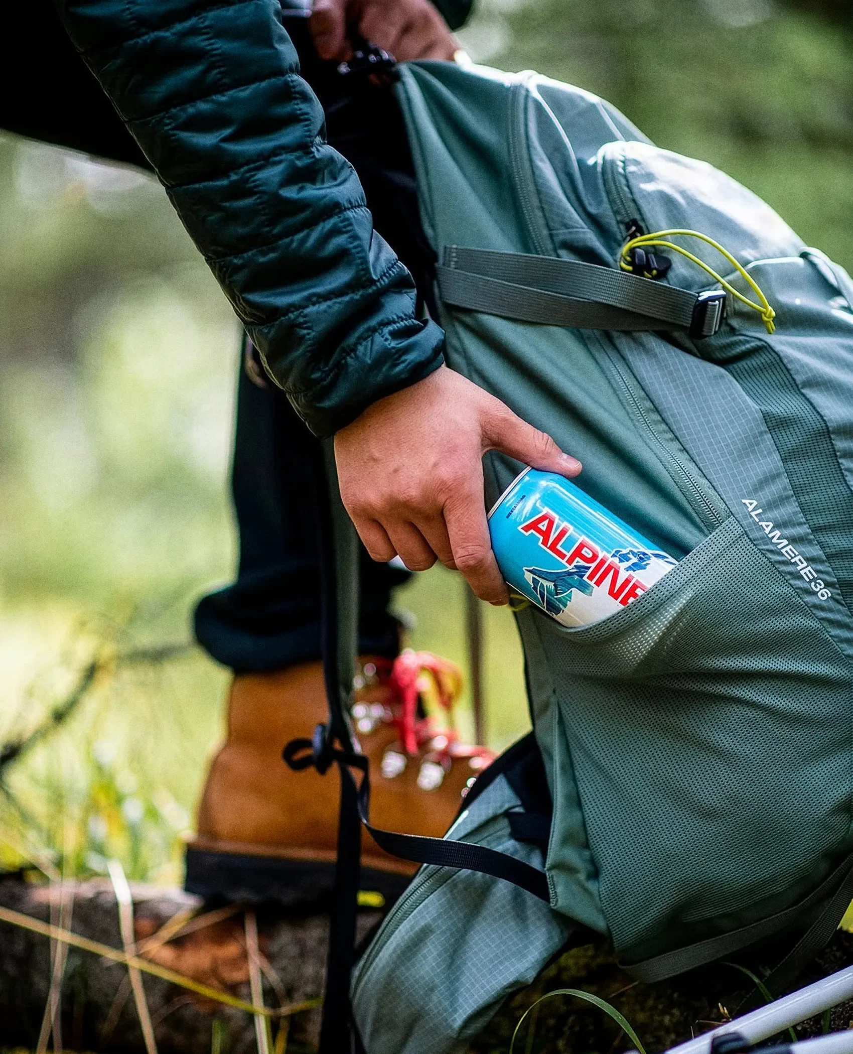
Alpine Lager is a beer defined by clarity. Light, crisp, and refreshing. But its identity wasn’t reflecting that same simplicity. The visual system felt heavier than the product itself, creating a disconnect between how it looked and how it should feel.
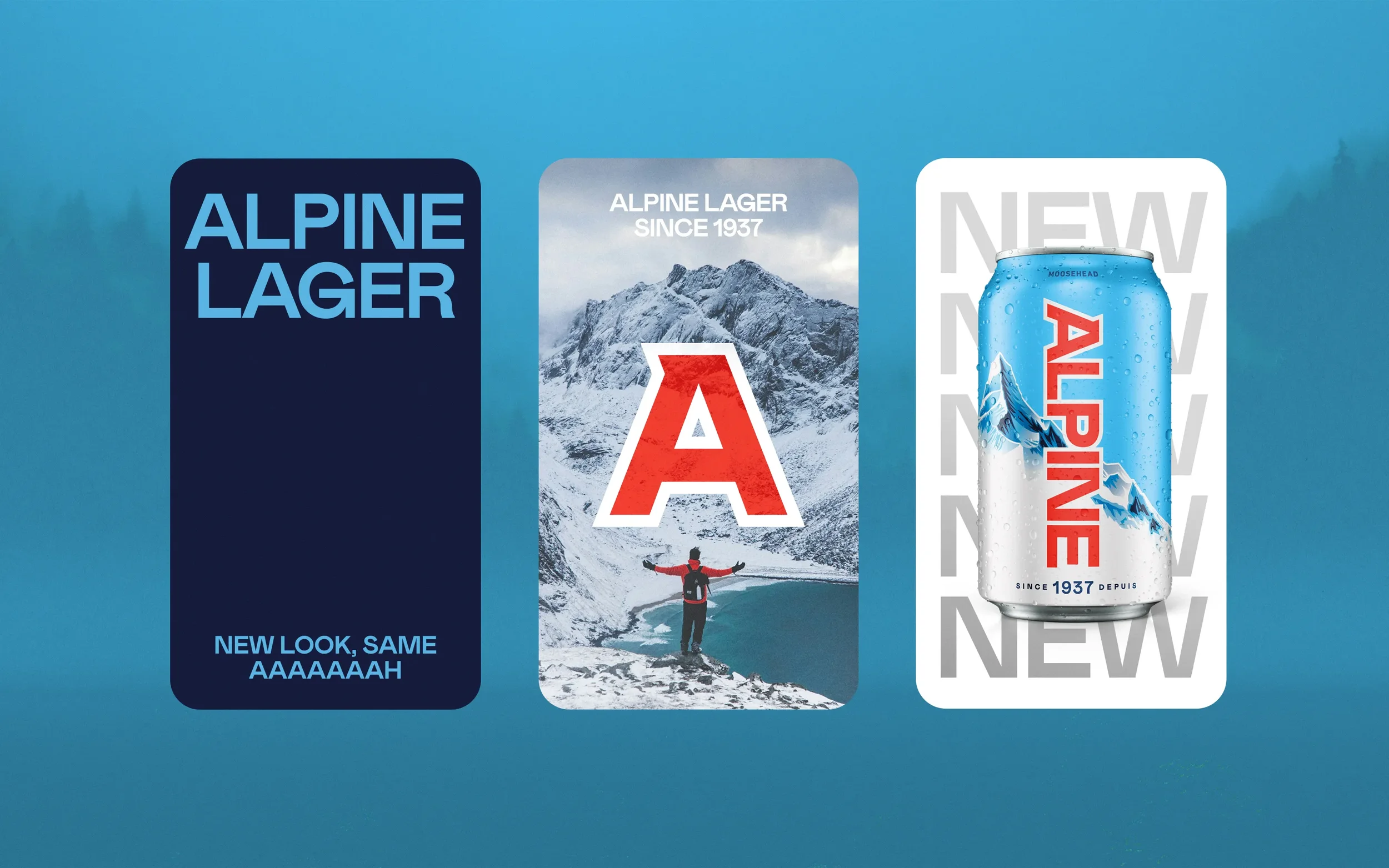
The redesign is an exercise in restraint. Instead of adding more, we removed what didn’t need to be there. A brighter, more open palette brings a sense of air and freshness, while a refined mountain graphic adds structure without overpowering the system. The goal wasn’t reinvention, but alignment, letting the identity better reflect the product.
The result is a cleaner, more confident system that feels closer to the beer itself. Balanced, minimal, and quietly expressive.
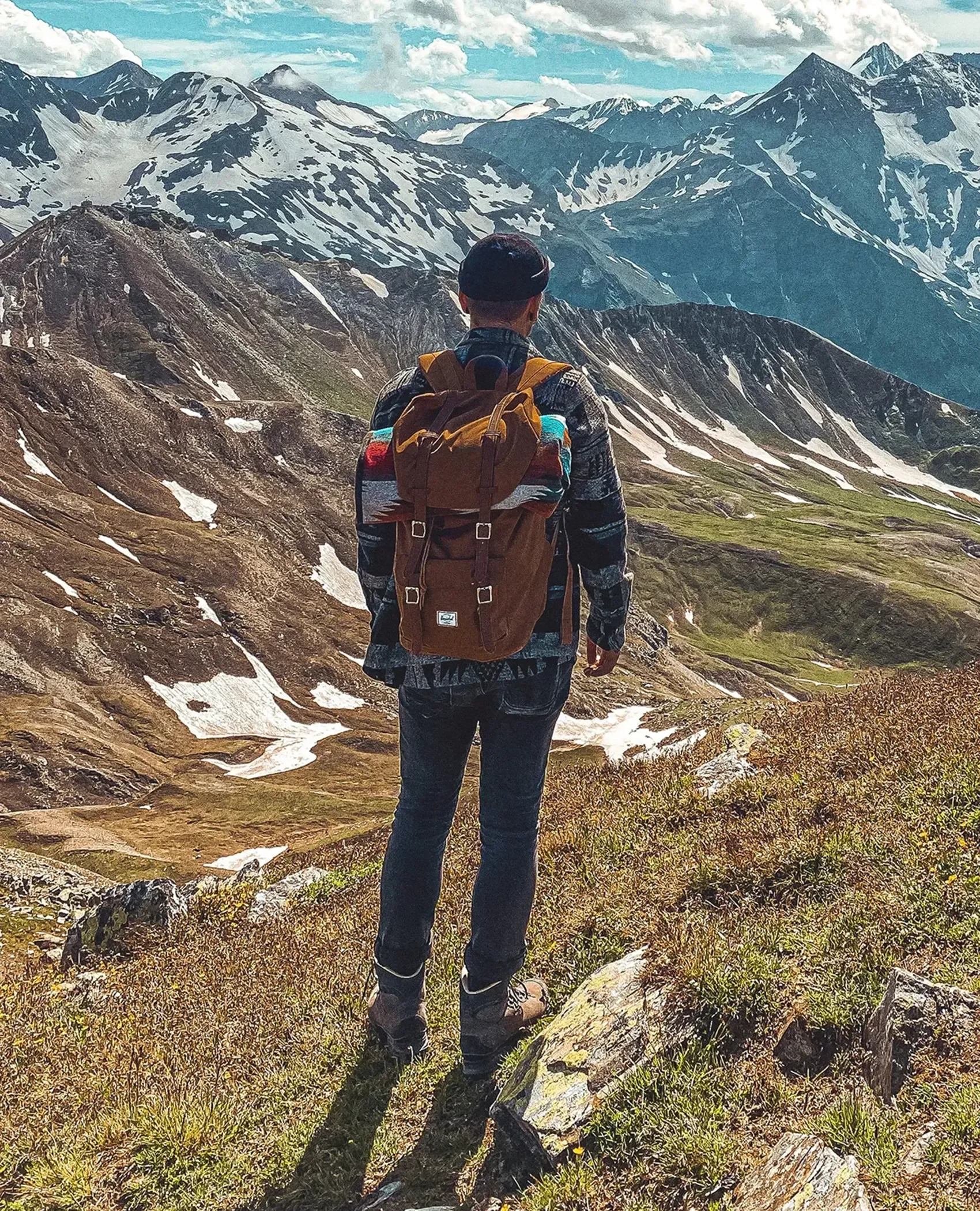
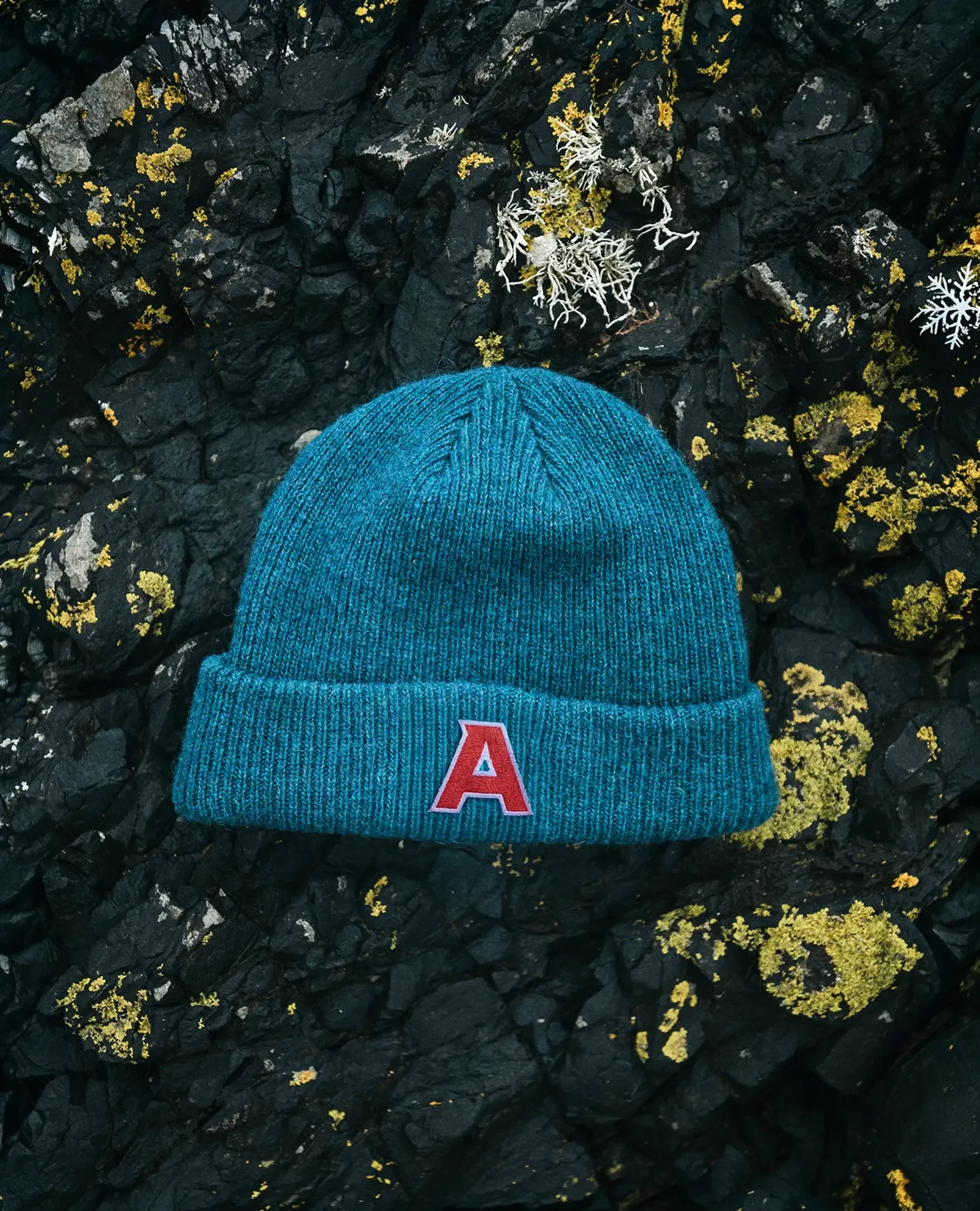
Select Photography by Brock Jorgensen