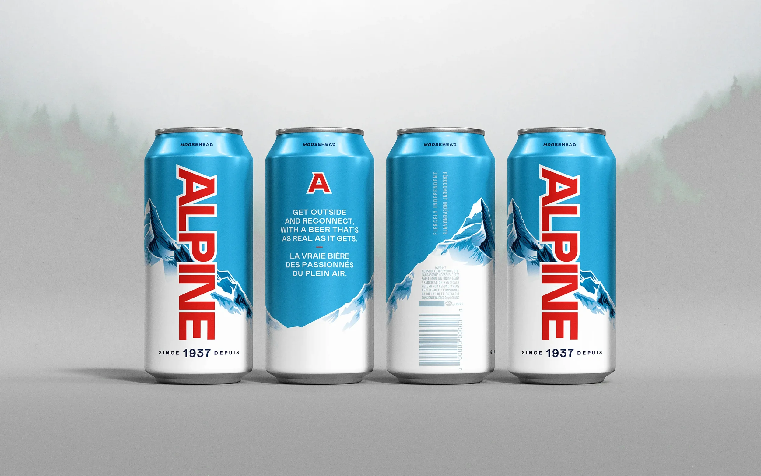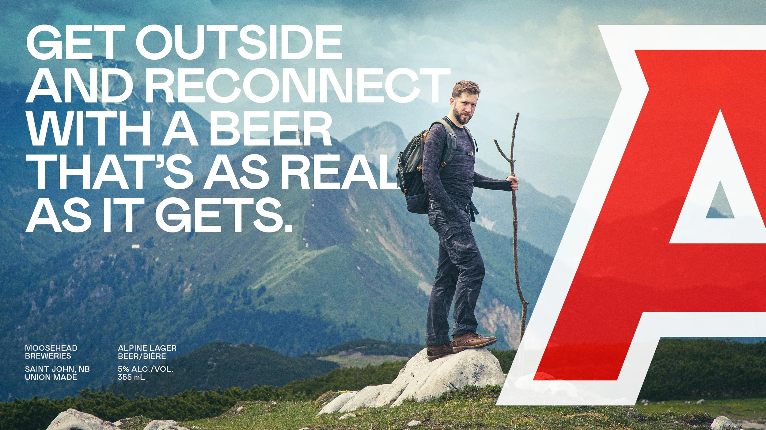

Alpine Lager
Services Brand, Print, Packaging
Role Design Lead
Studio Art & Mechanical
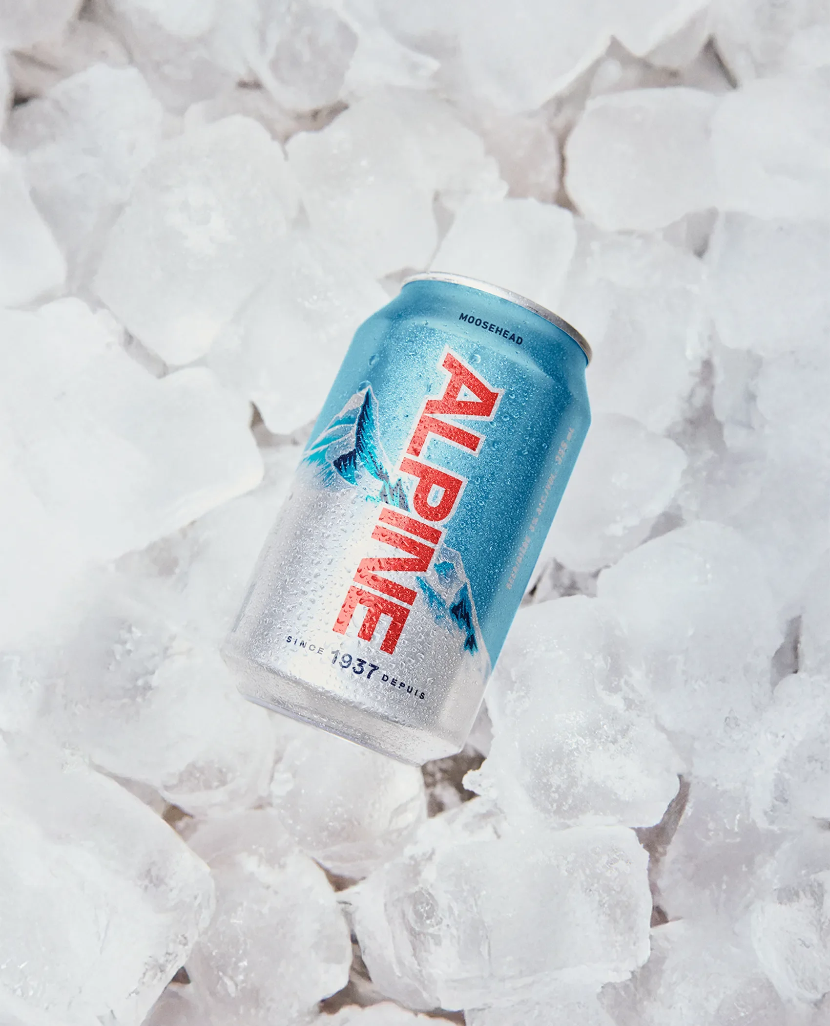
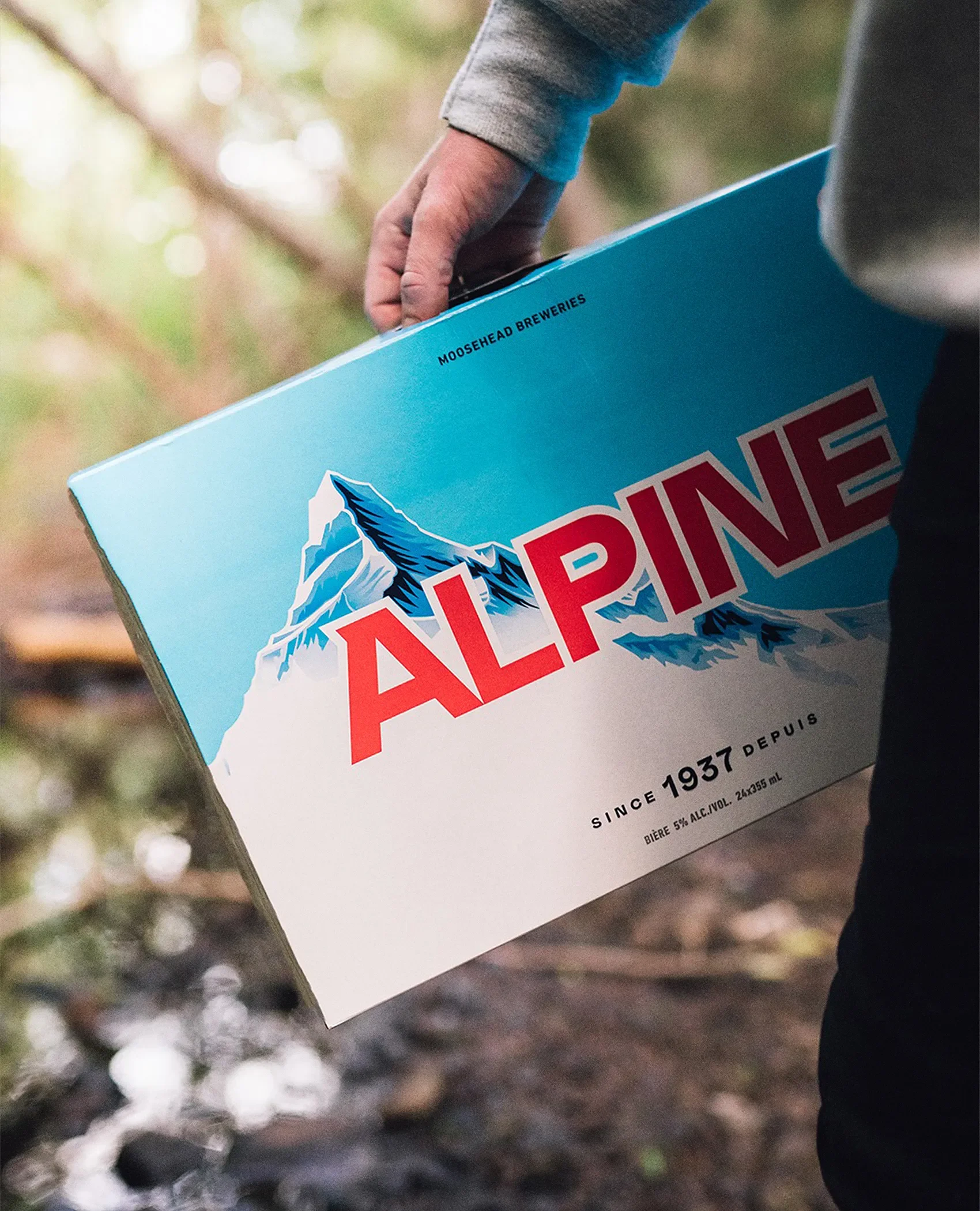
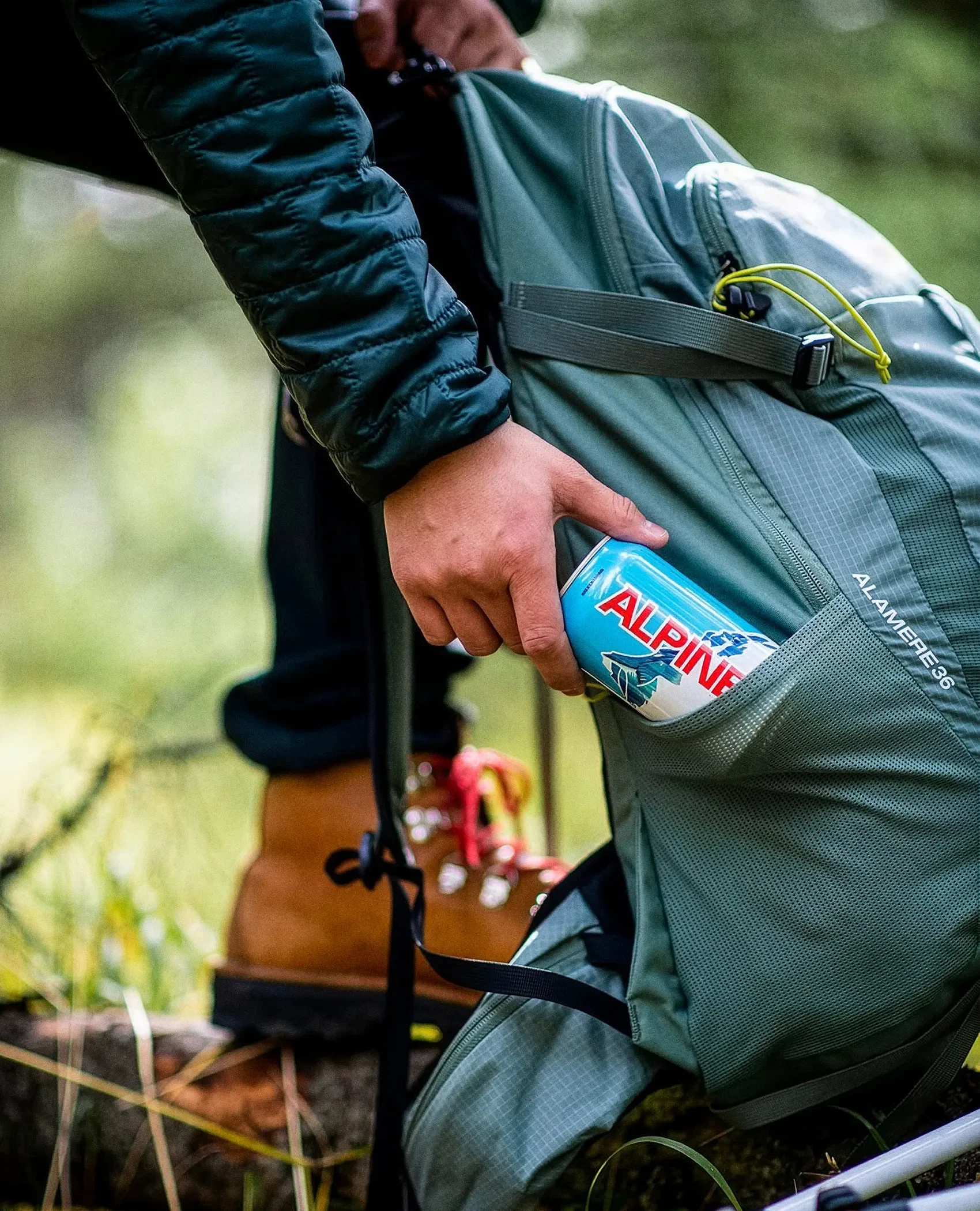
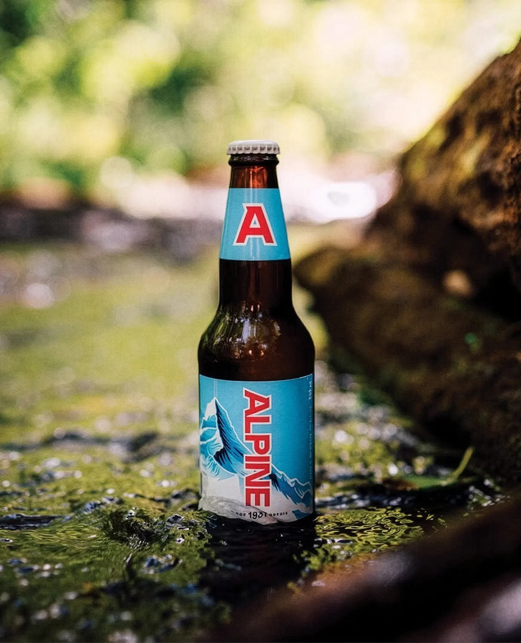
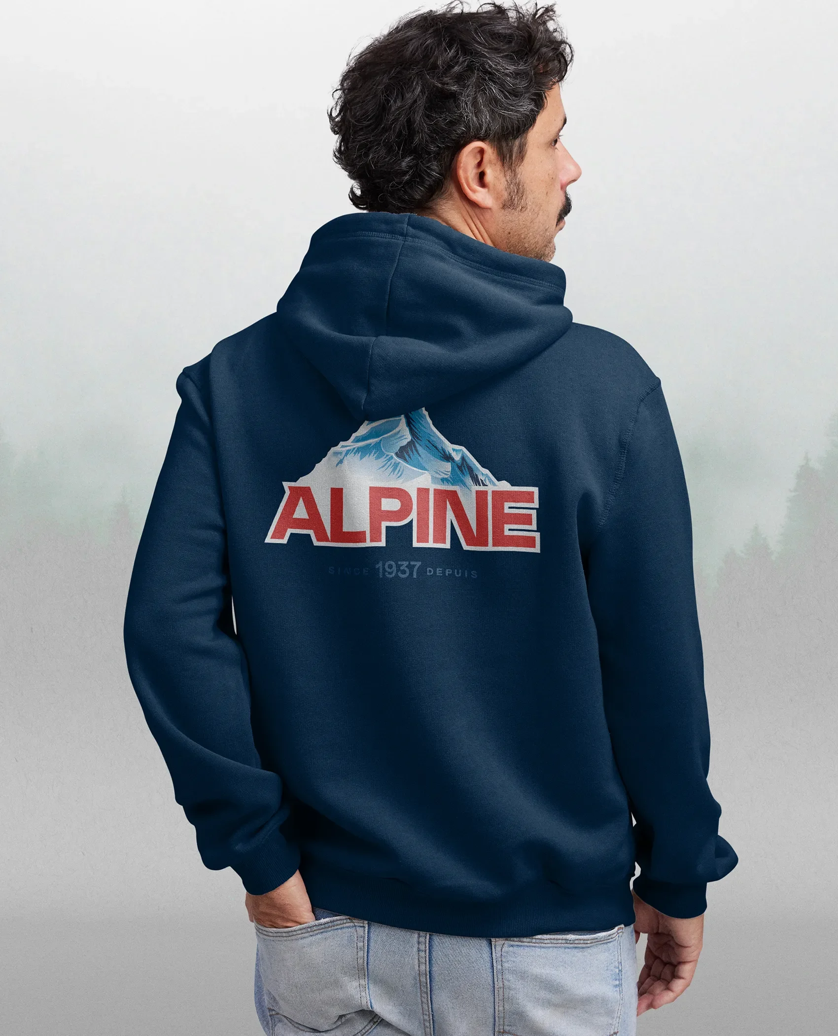
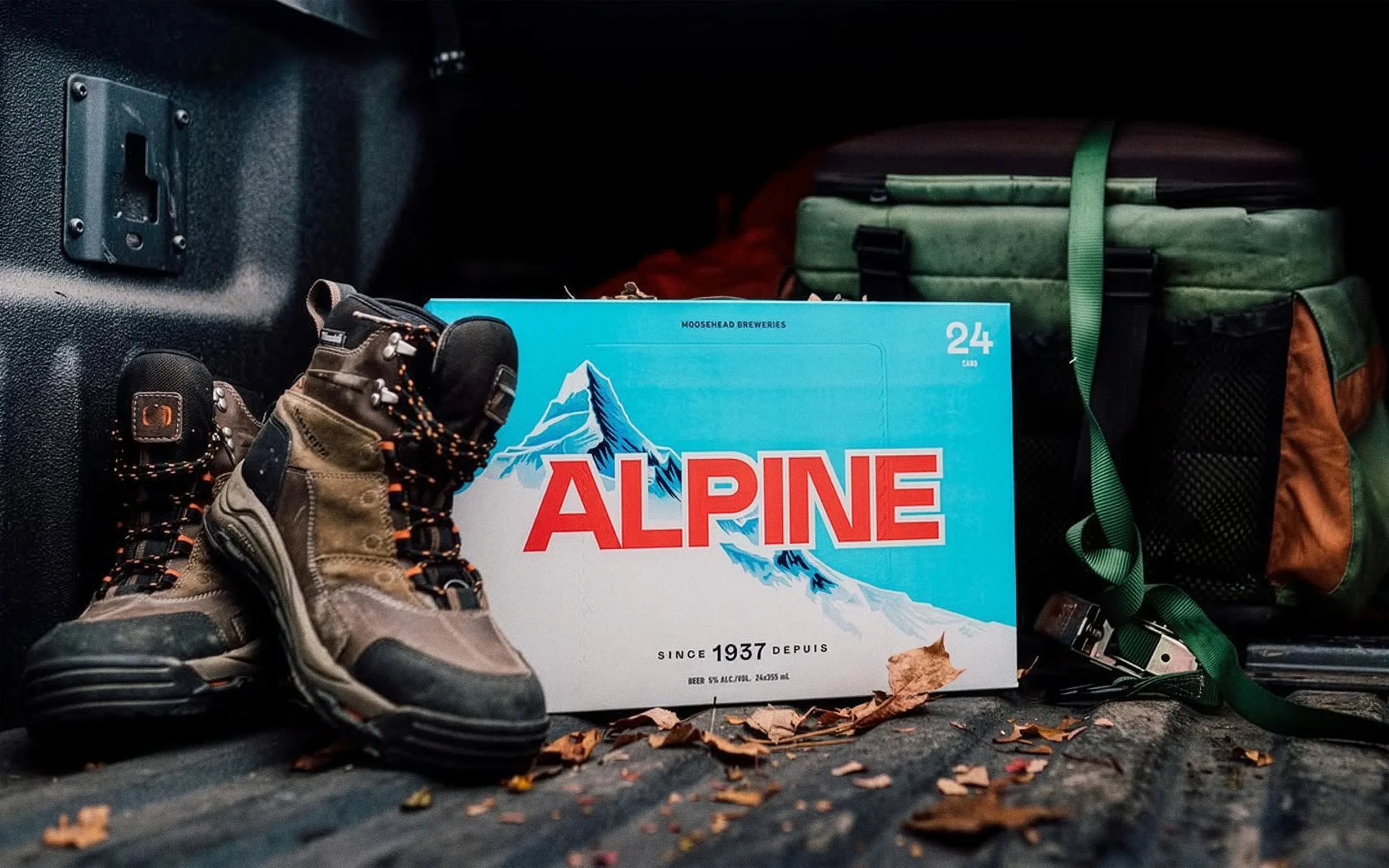
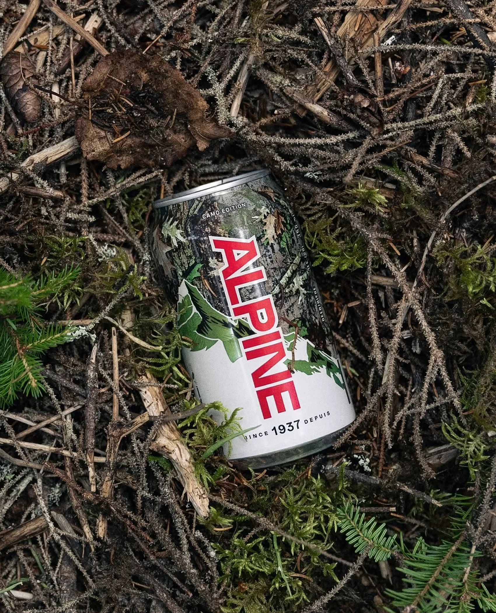
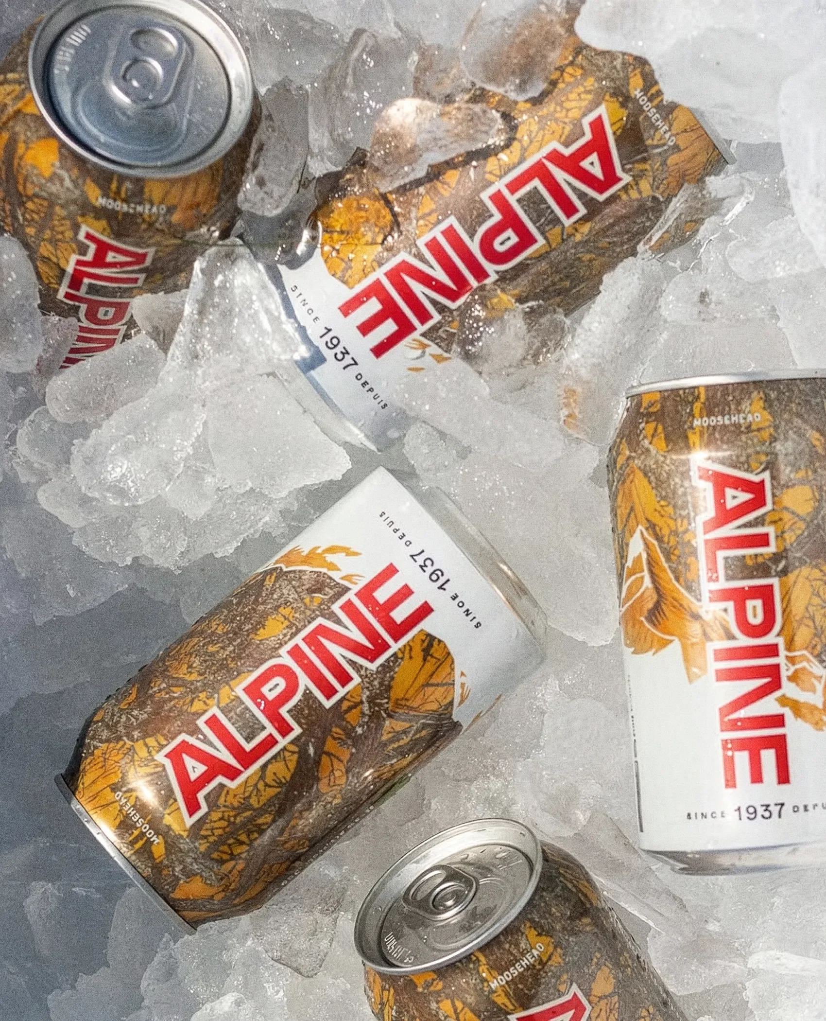
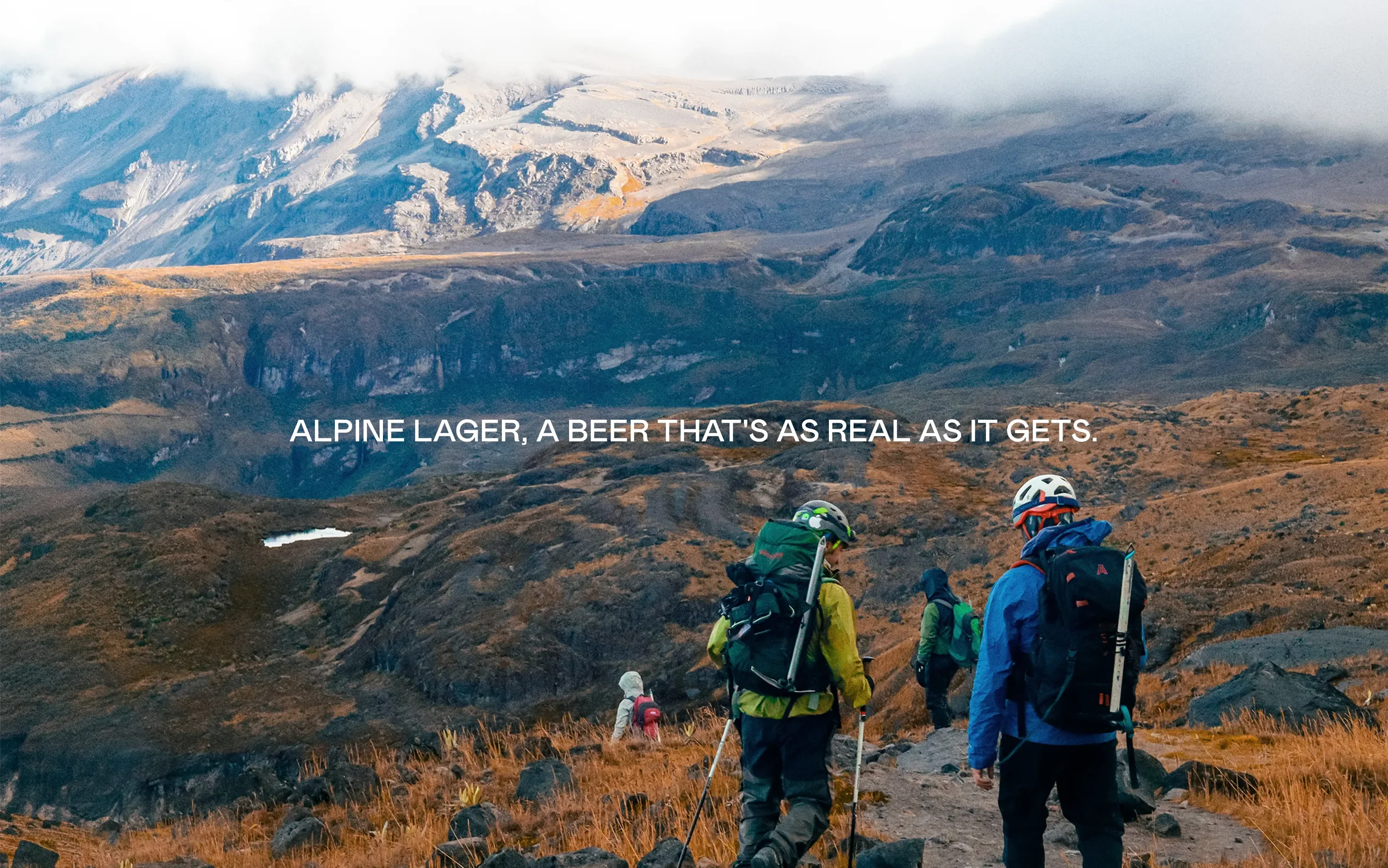
Alpine Lager is defined by clarity. It is light, crisp, and refreshing, but its identity told a different story. The original palette leaned dark and heavy, creating a disconnect between the product and how it was perceived.
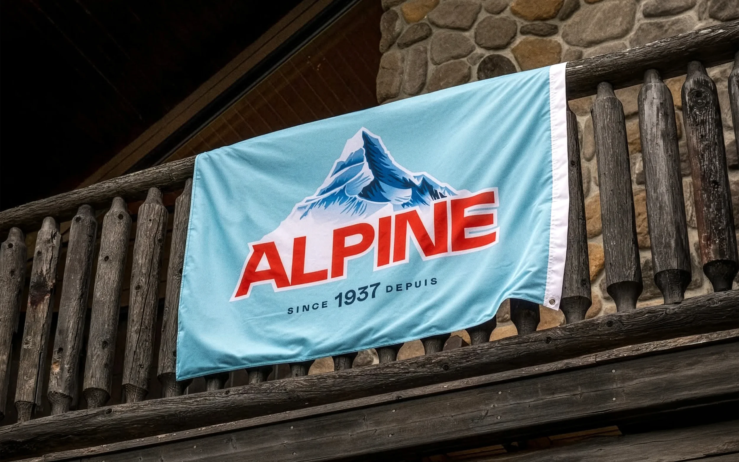
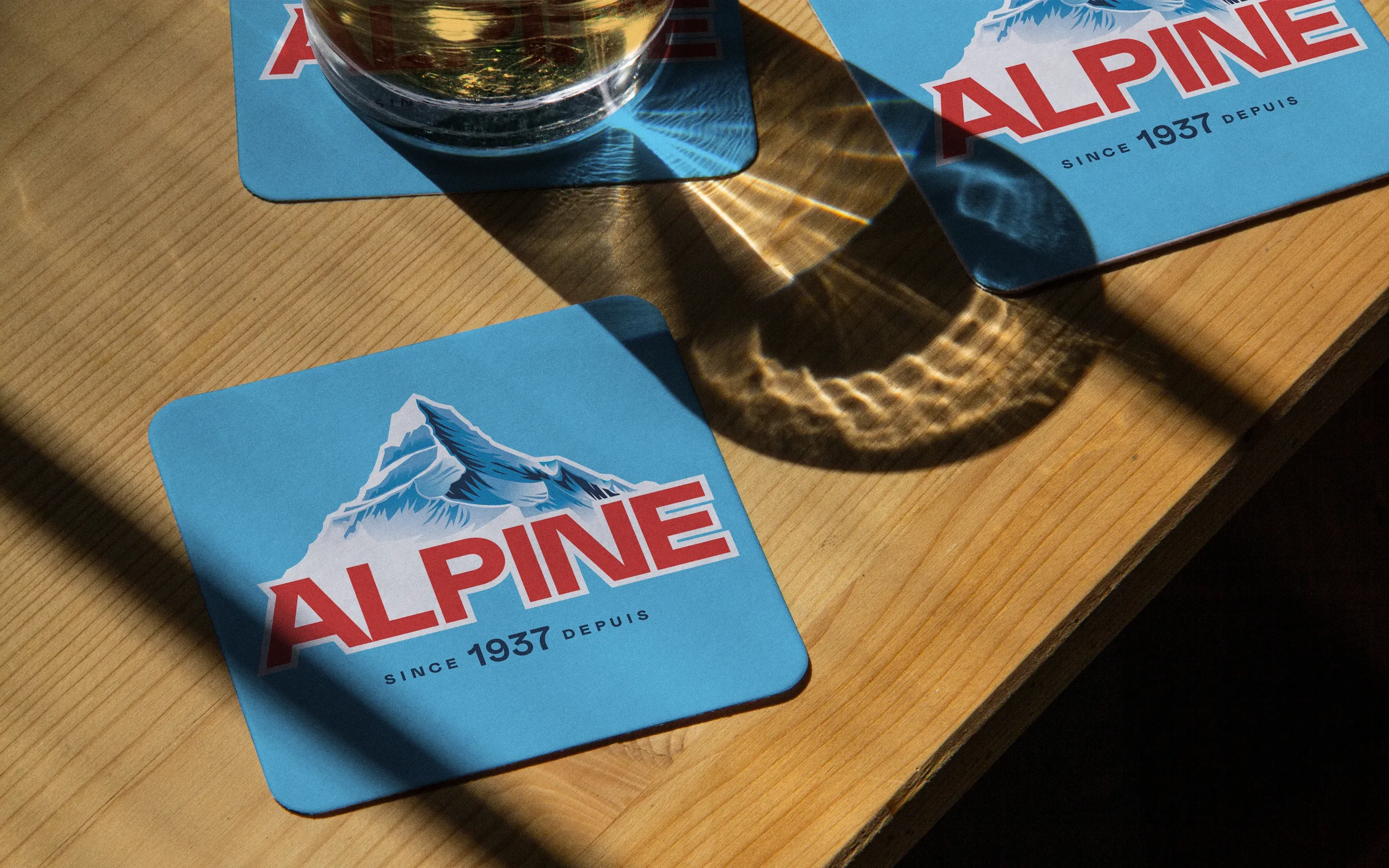
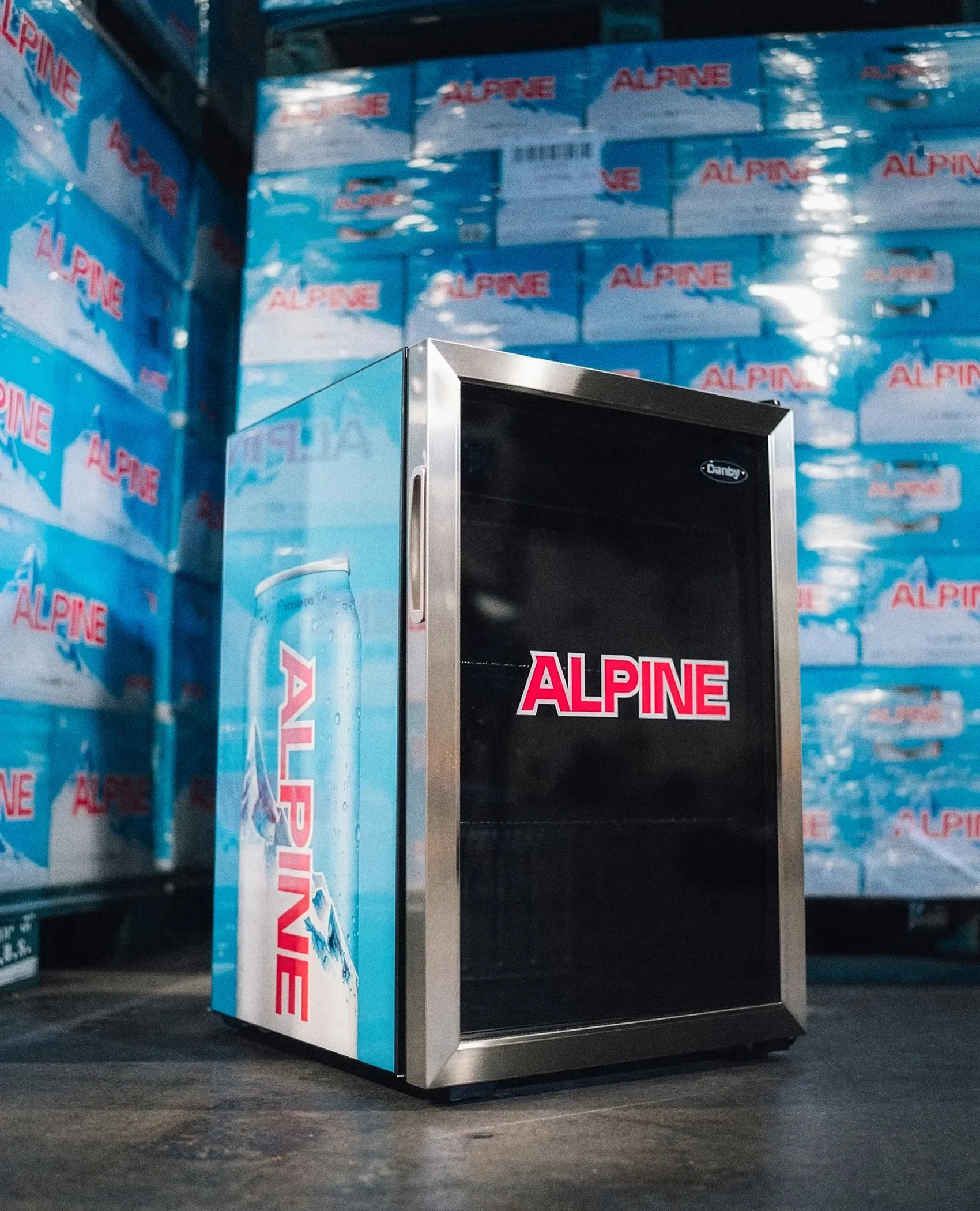
The redesign reorients the brand around that core experience. A brighter, more restrained palette introduces a sense of freshness, while a refined mountain motif brings structure and presence without feeling static or ornamental. Rather than reinventing the brand, the new system distills it by removing visual weight and focusing on what feels essential. The result is a more coherent identity that aligns with the beer itself: clean, balanced, and quietly confident.
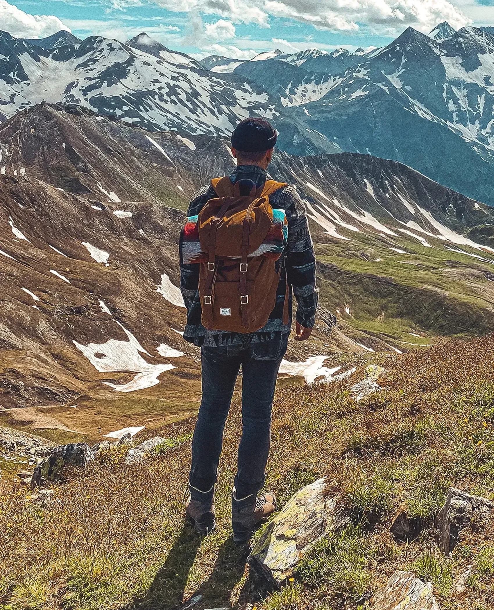
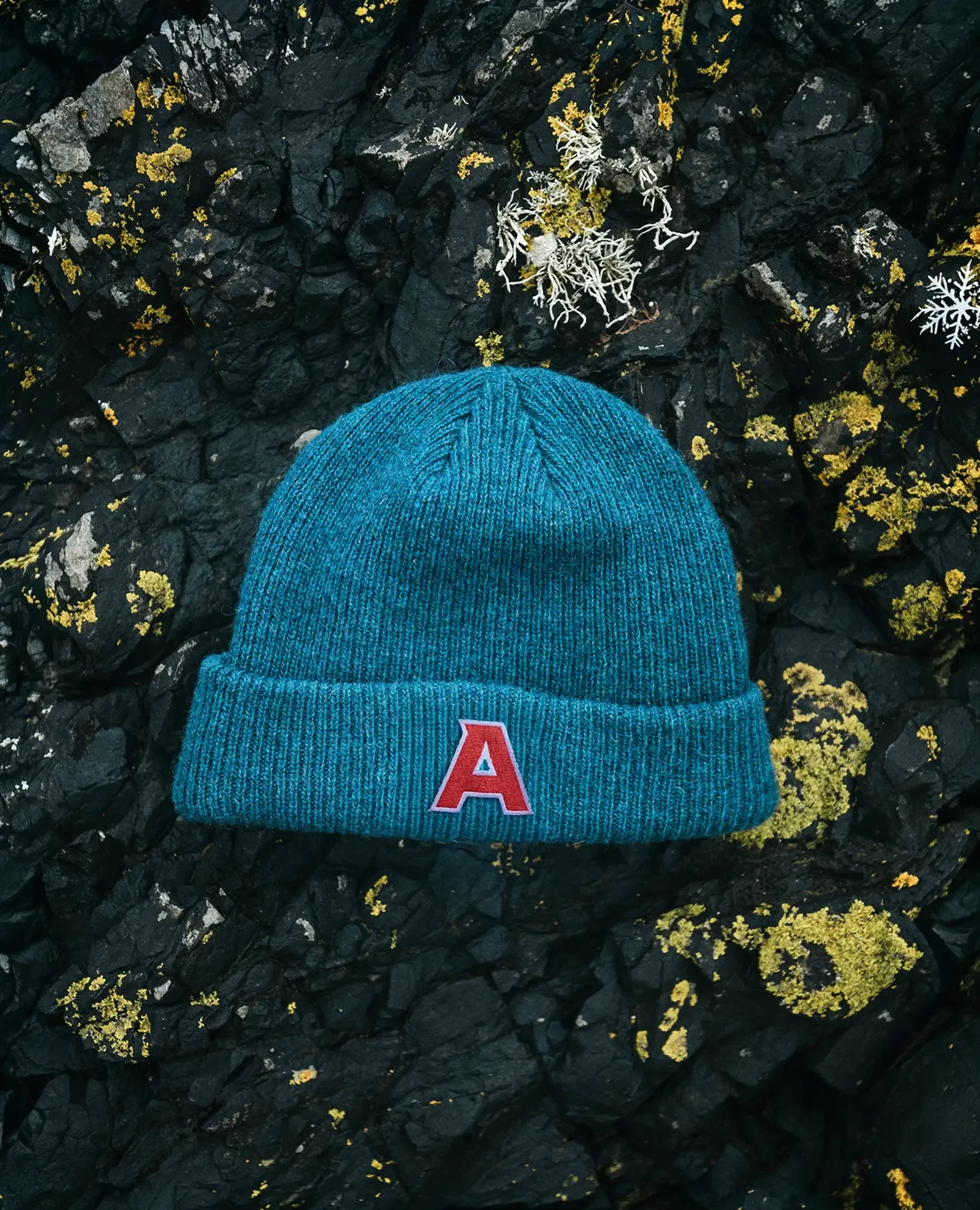
Select Photography by Brock Jorgensen